From book HTML & CSS - Design and Build Websites - Jon Duckett
CSS works by associating rules with HTML elements. These rules govern how the content of specified elements should be displayed. A CSS rule contains two parts: a selector and a declaration.
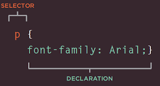
This rule indicates that all <p> elements should be shown in the Arial typeface.
Selectors indicate which element the rule applies to. The same rule can apply to more than one element if you separate the element names with commas.
Declarations indicate how the elements referred to in the selector should be styled. Declarations are split into two parts (a property and a value), and are separated by a colon.
CSS declarations sit inside curly brackets and each is made up of two parts: a property and a value, separated by a colon. You can specify several properties in one declaration, each separated by a semi-colon.

Selectors


How CSS rules cascade?
* {
font-family: Arial, Verdana, sans-serif;}
h1 {
font-family: "Courier New", monospace;}
i {
color: green;}
i {
color: red;}
b {
color: pink;}
p b {
color: blue !important;}
p b {
color: violet;}
p#intro {
font-size: 100%;}
p {
font-size: 75%;}
If there are two or more rules that apply to the same element, it is important to understand which will take precedence.
LAST RU LE
If the two selectors are identical, the latter of the two will take precedence. Here you can see the second i selector takes precedence over the first.
SPEC IFICITY
If one selector is more specific than the others, the more specific rule will take precedence over more general ones. In this example
h1 is more specific than *
p b is more specific than p
p#intro is more specific than p
IMPORTANT
You can add !important after any property value to indicate that it should be considered more important than other rules that apply to the same element.
Inherit
body {
font-family: Arial, Verdana, sans-serif;
color: #665544;
padding: 10px;}
.page {
border: 1px solid #665544;
background-color: #efefef;
padding: inherit;}
If you specify the font-family or color properties on the <body> element, they will apply to most child elements. This is because the value of the font-family property is inherited by child elements. It saves you from having to apply these properties to as many elements (and results in simpler style sheets).
You can compare this with the background-color or border properties; they are not inherited by child elements. If these were inherited by all child elements then the page could look quite messy.
You can force a lot of properties to inherit values from their parent elements by using inherit for the value of the properties. In this example, the <div> element with a class called page inherits the padding
size from the CSS rule that applies to the <body> element
Colors
/* color name */
h1 {
color: DarkCyan;}
/* hex code */
h2 {
color: #ee3e80;}
/* rgb value */
p {
color: rgb(100,100,90);}
BackGround Color
body {
background-color: rgb(200,200,200);}
h1 {
background-color: DarkCyan;}
h2 {
background-color: #ee3e80;}
p {
background-color: white;}
Opacity
p.one {
background-color: rgb(0,0,0);
opacity: 0.5;}
p.two {
background-color: rgb(0,0,0);
background-color: rgba(0,0,0,0.5);}
HSL & HSLA
body {
background-color: #C8C8C8;
background-color: hsl(0,0%,78%);}
p {
background-color: #ffffff;
background-color: hsla(0,100%,100%,0.5);}
TEXT

@font-face allows you to use a font, even if it is not installed on the computer of the person browsing, by allowing you to specify a path to a copy of the font, which will be downloaded if it is not on the user's machine.
@font-face {
font-family: 'ChunkFiveRegular';
src: url('fonts/chunkfive.eot');}
h1, h2 {
font-family: ChunkFiveRegular, Georgia, serif;}
font size
body {
font-family: Arial, Verdana, sans-serif;
font-size: 12px;}
h1 {
font-size: 200%;}
h2 {
font-size: 1.3em;}
Font-Weight
.credits {
font-weight: bold;}
Font-Style
.credits {
font-style: italic;}
Case
h1 {
text-transform: uppercase;}
h2 {
text-transform: lowercase;}
.credits {
text-transform: capitalize;}
UnderLines & Strike
.credits {
text-decoration: underline;}
a {
text-decoration: none;}
Leading
p {
line-height: 1.4em;}
Leading (pronounced ledding) is a term typographers use for the vertical space between lines of text. In a typeface, the part of a letter that drops beneath the baseline is called a descender, while the highest point of a letter is called the ascender. Leading is measured from the bottom of the descender on one line to the top of the ascender on the next.
In CSS, the line-height property sets the height of an entire line of text, so the difference between the fontsize and the line-height is equivalent to the leading (as shown in the diagram above).
Increasing the line-height makes the vertical gap between lines of text larger.
Letter & Word Spacing
h1, h2 {
text-transform: uppercase;
letter-spacing: 0.2em;}
.credits {
font-weight: bold;
word-spacing: 1em;}
Alignment
h1 {
text-align: left;}
p {
text-align: justify;}
.credits {
text-align: right;}
Vertical Alignment
#six-months {
vertical-align: text-top;}
#one-year {
vertical-align: baseline;}
#two-years {
vertical-align: text-bottom;}
Indent
h1 {
background-image: url("images/logo.gif");
background-repeat: no-repeat;
text-indent: -9999px;}
.credits {
text-indent: 20px;}
Drop Shadow
p.one {
background-color: #eeeeee;
color: #666666;
text-shadow: 1px 1px 0px #000000;}
p.two {
background-color: #dddddd;
color: #666666;
text-shadow: 1px 1px 3px #666666;}
p.three {
background-color: #cccccc;
color: #ffffff;
text-shadow: 2px 2px 7px #111111;}
p.four {
background-color: #bbbbbb;
color: #cccccc;
text-shadow: -1px -2px #666666;}
p.five {
background-color: #aaaaaa;
color: #ffffff;
text-shadow: -1px -1px #666666;}
First Letter Or Line
p.intro:first-letter {
font-size: 200%;}
p.intro:first-line {
font-weight: bold;}
Styling Links
a:link {
color: deeppink;
text-decoration: none;}
a:visited {
color: black;}
a:hover {
color: deeppink;
text-decoration: underline;}
a:active {
color: darkcyan;}
Responding To Users
input {
padding: 6px 12px 6px 12px;
border: 1px solid #665544;
color: #ffffff;}
input.submit:hover {
background-color: #665544;}
input.submit:active {
background-color: chocolate;}
input.text {
color: #cccccc;}
input.text:focus {
color: #665544;}
Attribute Selectors

Box Dimention
div.box {
height: 300px;
width: 300px;
background-color: #bbbbaa;}
p {
height: 75%;
width: 75%;
background-color: #0088dd;}
Limiting Width
td.description {
min-width: 450px;
max-width: 650px;
text-align: left;
padding: 5px;
margin: 0px;}
Limiting Height
h2, p {
width: 400px;
font-size: 90%;
line-height: 1.2em;}
h2 {
color: #0088dd;
border-bottom: 1px solid #0088dd;}
p {
min-height: 10px;
max-height: 30px;}
Overflowing Content
p.one {
overflow: hidden;}
p.two {
overflow: scroll;}
The overflow property tells the browser what to do if the content contained within a box is larger than the box itself. It can have one of two values:
hidden
This property simply hides any extra content that does not fit in the box.
scroll
This property adds a scrollbar to the box so that users can scroll to see the missing content.
Border Margin & Padding
The border-width property is used to control the width of a border. The value of this property can either be given in pixels or using one of the following values:
thin
medium
thick
(You cannot use percentages with this property.)
You can control the individual size of borders using four separate properties:
border-top-width
border-right-width
border-bottom-width
border-left-width
You can also specify different widths for the four border values in one property, like so:
border-width: 2px 1px 1px 2px;
The values here appear in
clockwise order: top, right, bottom, left.
p.one {
border-width: 2px;}
p.two {
border-width: thick;}
p.three {
border-width: 1px 4px 12px 4px;}
Border Style
p.one {border-style: solid;}
p.two {border-style: dotted;}
p.three {border-style: dashed;}
p.four {border-style: double;}
p.five {border-style: groove;}
p.six {border-style: ridge;}
p.seven {border-style: inset;}
p.eight {border-style: outset;}
You can individually change the styles of different borders using:
border-top-style
border-left-style
border-right-style
border-bottom-style
Border Color
p.one {
border-color: #0088dd;}
p.two {
border-color: #bbbbaa #111111 #ee3e80 #0088dd;}
ShortHand
p {
width: 250px;
border: 3px dotted #0088dd;}
Padding
p {
width: 275px;
border: 2px solid #0088dd;}
p.example {
padding: 10px;}
Margin
p {
width: 200px;
border: 2px solid #0088dd;
padding: 10px;}
p.example {
margin: 20px;}
Please note: If the width of a box is specified then the margin is added to the width of the box.
You can specify values for each side of a box using:
margin-top
margin-right
margin-bottom
margin-left
You can also use the shorthand
(where the values are in clockwise order: top, right, bottom, left):
margin: 1px 2px 3px 4px;
Sometimes you might see the following, which means that the left and right margins should be 10 pixels and the top and bottom margins should be 20 pixels:
margin: 10px 20px;
(This same shorthand shown above can also be applied to padding.)
Centering Content
body {
text-align: center;}
p {
width: 300px;
padding: 50px;
border: 20px solid #0088dd;}
p.example {
margin: 10px auto 10px auto;
text-align: left;}
If you want to center a box onvthe page (or center it inside the element that it sits in), you can set the left-margin and right-margin to auto.
In order to center a box on the page, you need to set a width for the box (otherwise it will take up the full width of the page).
Once you have specified the width of the box, setting the left and right margins to auto will make the browser put an equal gap on each side of the box. This centers the box on the page (or within the element that the box sits inside).
In order for this to work in older browsers (particularly IE6), the element that the box sits inside should have a text-align property with its value set to center.
The text-align property is inherited by child elements. You therefore also need to specify the text-align property on the centered box if you do not want the text inside it to be centered.
Change INLINE / BLOCK
The display property allows you to turn an inline element into a block-level element or vice versa, and can also be used to hide an element from the page.
The values this property can take are:
inline
This causes a block-level element to act like an inline element.
block
This causes an inline element to act like a block-level element.
inline-block
This causes a block-level element to flow like an inline element, while retaining other features of a block-level element.
none
This hides an element from the page.
In this case, the element acts as though it is not on the page at all (although a user could still see the content of the box if they used the view source option in their browser).
If you use this property, it is important to note that inline boxes are not supposed to create block-level elements
In this example you can see a list. Each item in the list is usually treated as a block-level element, but the rule for the <li> elements indicates that they should be treated as inline elements, which means they will sit alongside each other rather than appearing on new lines.
This technique is often used to create navigation for a site, and in this example a margin has been added to the right of each of the items to separate them out. The rule that applies to the <li> element whose class is coming-soon has been hidden as if it were not in the page at all.
Hiding Boxes
The visibility property allows you to hide boxes from users but It leaves a space where the element would have been.
This property can take two
values:
hidden
This hides the element.
visible
This shows the element.
If the visibility of an element is set to hidden, a blank space will appear in its place. If you do not want a blank space to appear, then you should use the display property with a value of none instead (as covered on the previous page).
li {
display: inline;
margin-right: 10px;}
li.coming-soon {
visibility: hidden;}
Border Images
No comments:
Post a Comment