To validate old web archives
http://web.archive.org/
Following is the example of yahoo
http://web.archive.org/web/*/yahoo.com
-----------------------------------------
https://marketplace.visualstudio.com/items?itemName=sidthesloth.html5-boilerplate
remember display and position/[left, right, bottom, top] will go hand in hand for position:relative
it works only when text taking all space.. if u specify width it wont work
so, give margin to an alement as left and right
https://wireframe.cc/
https://moqups.com/
http://ui-patterns.com/
https://dribbble.com/
https://sneakpeekit.com/
https://balsamiq.cloud/
https://sneakpeekit.com/
------------------------------------------
lg-- monitor ..likewise there are 3 more options -- by specifying this u can define at what time u want to change something.. this is really useful
Codeplay is really good site to validate the code on different sites.
to alight elements to left-- use ml-auto i.e. margin-left auto [auto means move everything to right with as much as space]
Navbar toggler --- if ur screen gets smaller.. navbar will get resized
https://tindog.co/
------------ Responsive Layout --- Bootstrap Grid ------------------
<body>
<div class="row">
#this will take 50% both col. if u remove one col.. remainng col will take everything
<div class="col"></div>
<div class="col"></div>
</div>
</body>
<div class="row">
# this 1 column will now take only 50% of the width
<div class="col-6">
</div>
<div class="row">
# this 1 column will now take only 25% of the width
<div class="col-3">
</div>
Remember.. its a 12 size system.. 12 columns in single row..
To make it responsive based on size
<div class="row">
<div class="col-md-6"> #md means medium
<div>
<div class="col-md-6"> #md means medium
<div>
</div>
Now.. above code will take 50-50 size on medium or bigger.. but anything smaller than medium, it will take call column size or 100$.. and columns will move in separate rows
now. if u want 4 items on desktop... 3 on tab and 2 on mobile?
create 4 columns as below.. sine 12 columns we can have.. each col will take 3 units
<div class="row">
<div class="col-lg-3"> #md means medium
<div>
<div class="col-lg-3"> #md means medium
<div>
<div class="col-lg-3"> #md means medium
<div>
but before u need to add its cdn
In order to tilt the image..
https://developer.mozilla.org/en-US/docs/Web/CSS/transform-function/rotate
How to make Image Circle?
border-radius = 100% -- this makes it appear as circle
https://bootsnipp.com/
----------Z Index -- CSS Stacking Order ---------------------
Children sit on top of parents.... so in html code.. what ever comes first from top in html will be closer to to bottom or screen and farer from top.
1. To stack elements on top of each other.. change the position as absolute in css..and then change the ordering of element in html... then based on order of element it will get stack
2. other way is change the z-index in css of element. Default z-index is 0 for all elements
z-index:1;--this will bring element up in hierarchy
or
z-index:-1-- this will bring element behind the hierarchy
position:absolute -- this has to be true.. then only z-index will work.. element should have some position-- absolute/relative/fixed--- it wont work on position:static
https://bootsnipp.com/
https://developer.mozilla.org/en-US/docs/Web/CSS/CSS_Positioning/Understanding_z_index
https://drive.google.com/uc?export=download&id=13Z1_Fgbh3QESIIoFpXUgo1F4sVjB9di2
https://www.appbrewery.co/p/web-development-course-resources
-----------------------Media Query-----------------------
https://search.google.com/test/mobile-friendly
http://home.global.co.za/~lambsoft/home.html
https://search.google.com/test/mobile-friendly?id=M_AROwcJ65KjZyZvbvl3Kg
Responsive Web
<h1>Hello World<h1>
@media <type> (feature){
feature
}
/*@media print{*/
/*@media screen{ */
@media speech{
h1{
color:red;
}
}
@media (max-width: 900px){
h1{
color:red;
}
}
https://webplatform.github.io/docs/css/media_queries/height/
@media (min-width: 900px) and (max-width: 1000px){
h1{
color:red;
}
}
this will change the color red when width of a screen is between 900 to 1000 px.
Footer-------------
add icons from font awesome
https://fontawesome.com/
to reference in same page..
<a href="<id>">contact</a>
<a href="#footer">contact</a>
<div id="footer">
</div>
This works in same page at href# but as well as URL level.. i mean in url if u specify #<id>.. u will get moved to that level..
---------------Deploying ur site on Horokuapp -----------------
https://www.mongodb.com/cloud/atlas
u need to dpeloy ur mongo db to cloud.. so horoku can access ur data which is hosted on cloud..
Create mongo db cluster...
Select AWS .. N-Vergenia-- and free tier..
Change cluster M0-- which is free for ever..this is awesome
No need to give credit card details
Default cluster name is Cluster0

Once cluster is created it will appear like below

As u can see... at left panel.. there is a section called security and under that 3 options called
DB Access
NetWork Access
Advance..
Select DB Access and add a new user


After that go to Network Access section.. and whitelist an ip address

Click on allow access from anywhere..
Once u do that.. new entry will get added with following list
0.0.0.0/0 (includes your current IP address)
Now.. go back to cluster and connect to it

select connect using mongo shell..
In order to select mongo shell version
1. first connec to mongo db using mongo db compass
2. open command prompt or anaconda prompt.. and type mongod to check if mongo db is connection
3. now run following command
(base) C:\Users\manda>mongo --version
MongoDB shell version v4.2.1
git version: edf6d45851c0b9ee15548f0f847df141764a317e
allocator: tcmalloc
modules: none
build environment:
distmod: 2012plus
distarch: x86_64
target_arch: x86_64
4. So here mongo shell version is 4.2.1

which is same as we have here.. if its not same.. change is as needed..
Copy the connection string url which is as below
mongo "mongodb+srv://cluster0-x4wnf.mongodb.net/test" --username mandargogate
After running this command from command prompt, I got following error
DNSHostNotFound: Failed to look up service "":This operation returned because the timeout period expired.
https://github.com/metabase/metabase/issues/9867
https://stackoverflow.com/questions/55893437/cant-connect-mongo-shell-to-mongo-atlas-m0-using-mongodbsrv
So the issue got resolved by adding mongo.exe [which we downloaded from https://cloud.mongodb.com/v2/5e07b6435538553e41de9dd6#clusters after clicking on connect] to C:\Windows or [%windir%] folder. By default all windows system variables are loaded when OS is started.. so after keeping file in same folder.. we do not need to define separate path or variable for mongo since its already in system variable...

------------------------------R--------------------------------
1-Jan
In activity 0.. I opened a file from R-Studio.. which has scripts for installation.
I selected all of them and clicked on Run.. which started the actual installation...
it took almost a 30min to install everything
-----------------
Also make sure u install R and R-Studio both
Vector is one of the data structure and it starts with c
my_ar = c("1","2")
note- all elements here as to be of same data type
http://web.archive.org/
Following is the example of yahoo
http://web.archive.org/web/*/yahoo.com
-----------------------------------------
https://marketplace.visualstudio.com/items?itemName=sidthesloth.html5-boilerplate
Visual Studio Code HTML Boilerplate
This extension provides the standard HTML boilerplate code used in all web applications.
Usage
Type 'html5-boilerplate' in an HTML file and select the snippet from the auto suggestion dropdown to get the HTML boilerplate.
----------------------------------------------
u can just copy paste the icon from above or below link..into html page e.g. in title tag 🎅
-----------------
VS Code HTML indentation
------------------
prior gives more meaning so use new tags instead of old tags
em vs i
strong vs b
<table>
<thead>
<tr>
<td></td>
</tr>
</thead>
<tbody>
</tbody>
<tfoot>
</tfoot>
</table>
All following tags will go inside form tag -- here action can be index.html however, if u specify mailto:<emailid>, it will opens up email application by default and all specified email address in to
if u dont specify enctype="text/plain" -- then when email app will open, it will have some default text if ur html chartype in meta tag is specified as utf-8
<form action="mailto:mandargogate@gmail.com" method="post" enctype="text/plain">
this will create an input to a form
<input type="text" name="">
this will create a submit button to a form
<input type="submit" name="">
this will create a color picker
<input type="color" name="">
this will create a check box
<input type="checkbox" name="">
this will create a password input
<input type="password" name="">
this will create an email input
<input type="email" name="">
</form>
textarea / file / date / ratio / range are more options which are important.
<textarea name="name" rows="10" columns="30"></textarea>
----
1. Create a new repository in GitHub as CV [choose readMe file in repo]
2. upload ur cv websites [index.html and other files] at repositry
3. commit ur changes - make sure commit directly to master branch is checked
4. go to settings tag in same repository and scroll down at GitHub pages
5. In source section, dropdown.. choose master branch [by default it would be non]
6. it wll show a message with link.. mostly it wiould be https://<githubid>.github.io/<repositoryName>
--------------------------------------- CSS ----------------------------------
CSS documentation
to choose color palet
you can copy the hex code by selecting different templates
Color Keywords & HexCode
default css -- these are by default applied by browser
e.g.
| h1 | display: block; font-size: 2em; margin-top: 0.67em; margin-bottom: 0.67em; margin-left: 0; margin-right: 0; font-weight: bold; |
To get borders - chrome plugin-- make sure u install it
documentations for css, html, etc
hr{
width=100px
or
width=30% -- this is useful when u r having different screens
}
hr{
border-style: dotted none none;
border-color: gray;
border-width: 5px;
width: 5%
}
<link rel="stylesheet" href="css/styles.css">
precedence of css is unless u specify !important
inline css
internal/in-page css
external/global css
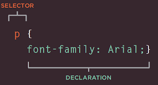
CSS Rules
selector { property : value; }
who { what : how; }
Keep all css rules in alphabetical order
css properties which we can change
To get images
Make sections in css file
tag selectors (html tag)
class selectors (. selector)
id selectors (# selector)
u can have more than one class to a tag but not ids
following will change the border to round.. element will appear as a circle
border-radius: 100%;
psudo class-- as elements has different states
/* Any button over which the user's pointer is hovering */
button:hover {
  color: blue;
}
favicon (or favorite icon)
import an image, or draw an image and above website will give a favicon
<link rel="icon" href="img/favicon.ico">
-------------
-------------
div{
backgroup-color: <color>
}
<div class="">
<h1> header1 </h1>
<p> this is a paragraph </p>
</div>
user-agent style-sheets -- in chrome developer under element/style section are default styles applied by the browser
e,g. if u check default styles for body or h1 tag, it will have margin before and after
------------------------------
body{
margin: 0;-- when its 0 u dont have to specify unites. e.g. pix; when u specify one value it will apply for all 4 sides
}
------------------------------
css box model
for dom container like div it has
width
height
border -- which comes after width & height; u can also specify border-width, at all 4 sides
{border-width: 0px 10px 20px 30px}
if we have come content in div & if u dont specify the height or width.. it will take h & w of a content inside it
u can give padding to the content inside the div
margin comes outside of the border....whereas padding comes inside the border
validate this under chrome develper tools..under styles section. this is called box model which basically is
width & height
content
padding
border
margin
------------------------------
----------------
CSS DISPLAY PROPERTY
by default some elements are block display also called as block elements. i.e. it takes entire width.. blocks everything on that row
e.g. p, header, list, forms etc takes entire row in html page
<span> (is also called inline display elements) can be used as optional element by which u can specify different style sheets..since its not a blocking element it wont affect ur display.. otherwise if u use div or p.. it will affect the display since those are blocking elements
block display elements
div, p, header, forms, list
inline display elements
span. img, a or anchor
css display property.
it has 4 different values as below
why would be use block elements instead of inline elements? because for inline elements u can't change the width. it takes the width of its container.. whereas for block elements u can specify the width
----imp---->
now... in order to use block elements as an inline elements, u need to change the display propert of it by doing
display: inline; but now u cant change the width of it
now if u want to change the width and appear element as inline -- this both u can do using
display: inline-block
there are 4 display values in css
block
none -- if u use none, it will kind of hide the element
inline
inline-block
there are 2 ways u can hide the element in html
1. display: none
2. visibility: hidden
---------------------
CSS Positioning
---------------------
default positioning
1. content is everything.. parent elements will take size of contents..based on box model
2. order of elements comes from html code.. e.g h1 and then p.. then website will appear in that order
3. children sit on top of parents i,e. z index
<div>
<h1> this <span>is</span> a header</h1>-- h1 will sit on div and span on h1
</div>
css position property instead of default layout
static -- this is a default html rule discussed above
relative -- top bottom left right -- coordinates property to change the position. this means move the element from its current position based on coordinates provided. Position is relative to the edge of co-ordinate provided. if left cooridinates provided, it will move from left edge.. if right property .. right edge stays same.. but element moves..
absolute
fixed
remember display and position/[left, right, bottom, top] will go hand in hand for position:relative
display inline to make everything on same line..
and position is to move the position based on coordinates
Absolute positioning
position: absolute
right:30px
now when u specify absolute position, it is relative to parents and not the elements edge itself. so above code will move the element to right of the window..
whereas if u change position to relative.. same code will change the element to left... which is relative to its own right margin.
another thing is,, when we use absolute position, it will affect other elements like cut and paste,,,and re positions other elements as well.
Absolute positioning is very easy to handle than relative positioning...
Give parent a relative position and contents inside it define as absolute..
Fixed Positioning
this will fixed the position .. for nav bar.. so even if u scroll it will stay fix.. its really good and useful thing
position: fixed for an element
Centering
text-align: center
it works only when text taking all space.. if u specify width it wont work
so, give margin to an alement as left and right
width:10%
margin: 0 auto 0 auto [top left bottom right]
u can specify element as absolute which will go out of the flow.. and keep remaining elment relative or static.
--------------FONT---------
font-family
usually use sans-serif [arial] or serif [this is by default i.e. Times]
Cursive or Fantasy --- are not readable
monospace is mainly for code
u can also specify
font-family: verdana, sans-serif; [first verdana will get apply, but if its not available then sans-serif will get apply]
websafe fonts are most likely available in all browsers or os...
at above site u can check the fonts on os...win vs mac vs linux
u can copy fall back code from above site.. click on icon beside the font listing and paste that in css file
Now, if u want to make sure ur fonts renders in all os.. better u go for a embedded fonts of google
just select all fonts by selecting add on this site..copy the link from google font site and paste it in ur css file..
to generate dummy data
to get icons
to make a font size dynamic
instead of using px use %
e.g. 90px ==> 562.5%
or u can use em...
562.5em;
1m = 1em = 16px = 100%
if u change the font size at browser and in ur html code if u have mentioned px then browser won't change the font size.. but if u specify % or em.. it will do change.. thats the only advantage or em or %
another imp diff is... if u specify em for body.. that font size will get inherited for all child elements in that body
in css3 u also have rem..root-em which will ignore all parents settings and do em settings relative to current element.. use this always as its reliable and least error prone
Keep auto margin for left and right in order to make the element in middle..
font-color
font-weight
for centering an element
give left right margin as auto
or text-align: center
to give space between lines of paragraph
line-height: 2;
use it only to wrap text around image.. do not use it for positioning..
Floating --- will wrap
float: left
Clear -- will un-wrap
clear: left
if u want to remove underline from anchor tag change text-decoration: none;
a:hover{
color: #eaf6f6
}
-------------BOOTSTRAP-------------
class="jumbotron"
CDN -- Content Delivery Network
if u specify href with local file.. browser won't cache it.. but if u specify cdn.. browser identifies it as global/universtal and it caches that so it is always faster..
https://wireframe.cc/
https://moqups.com/
http://ui-patterns.com/
https://dribbble.com/
https://sneakpeekit.com/
https://balsamiq.cloud/
https://sneakpeekit.com/
------------------------------------------
lg-- monitor ..likewise there are 3 more options -- by specifying this u can define at what time u want to change something.. this is really useful
Codeplay is really good site to validate the code on different sites.
to alight elements to left-- use ml-auto i.e. margin-left auto [auto means move everything to right with as much as space]
Navbar toggler --- if ur screen gets smaller.. navbar will get resized
https://tindog.co/
------------ Responsive Layout --- Bootstrap Grid ------------------
<body>
<div class="row">
#this will take 50% both col. if u remove one col.. remainng col will take everything
<div class="col"></div>
<div class="col"></div>
</div>
</body>
<div class="row">
# this 1 column will now take only 50% of the width
<div class="col-6">
</div>
<div class="row">
# this 1 column will now take only 25% of the width
<div class="col-3">
</div>
Remember.. its a 12 size system.. 12 columns in single row..
To make it responsive based on size
<div class="row">
<div class="col-md-6"> #md means medium
<div>
<div class="col-md-6"> #md means medium
<div>
</div>
Now.. above code will take 50-50 size on medium or bigger.. but anything smaller than medium, it will take call column size or 100$.. and columns will move in separate rows
now. if u want 4 items on desktop... 3 on tab and 2 on mobile?
create 4 columns as below.. sine 12 columns we can have.. each col will take 3 units
<div class="row">
<div class="col-lg-3"> #md means medium
<div>
<div class="col-lg-3"> #md means medium
<div>
<div class="col-lg-3"> #md means medium
<div>
<div class="col-lg-3"> #md means medium
<div>
</div><div>
above will take 100% on all sizes, but thats now what we wanted is on medium screen only 3 elements should appear..means 12/3=4 columns items should occupy on medium screen.. thats why we give col-md-4
<div class="row">
<div class="col-lg-3 col-md-4"> #md means medium
<div>
<div class="col-lg-3 col-md-4"> #md means medium
<div>
<div class="col-lg-3 col-md-4"> #md means medium
<div>
<div class="col-lg-3 col-md-4"> #md means medium
<div>
<div>
</div>
Now on mobile, we need only 2 items per line.. i.e. 12/2 = 6.. so each item should take 6 columns and that we can do by col-sm-6
<div class="row">
<div class="col-lg-3 col-md-4 col-sm-6"> #md means medium
<div>
<div class="col-lg-3 col-md-4 col-sm-6"> #md means medium
<div>
<div class="col-lg-3 col-md-4 col-sm-6"> #md means medium
<div>
<div class="col-lg-3 col-md-4 col-sm-6"> #md means medium
<div>
<div>
</div>
col-lg-3 -- if u just specify this.. it will keep 3 col width for item on large or bigger screen but for remaing all screen each item will take 100% size
----------------------
Use section as a tag.. so make different sections.. and give separate class for that..give bgcolor separately for each section..
when u create a nav bar-- specify it under section tag.. and dont give that a backgroup color.. so it will take a color or section..
for line-height we dont specify size e.g. px or rem as its always a times.. i.e. 1.5 times , 2 times etc
container-fluid -- will always take 100% of screen.. even if the size changes.. it adjust iself
container -- this is a normal container.. which changes size as per screen size.. and don't take 100% width
note-- add container under section tag...
u can download icons from
u can simply copy it with copy button on web page
<i class="fab fa-apple"></i>but before u need to add its cdn
In order to tilt the image..
https://developer.mozilla.org/en-US/docs/Web/CSS/transform-function/rotate
How to make Image Circle?
border-radius = 100% -- this makes it appear as circle
https://bootsnipp.com/
----------Z Index -- CSS Stacking Order ---------------------
Children sit on top of parents.... so in html code.. what ever comes first from top in html will be closer to to bottom or screen and farer from top.
1. To stack elements on top of each other.. change the position as absolute in css..and then change the ordering of element in html... then based on order of element it will get stack
2. other way is change the z-index in css of element. Default z-index is 0 for all elements
z-index:1;--this will bring element up in hierarchy
or
z-index:-1-- this will bring element behind the hierarchy
position:absolute -- this has to be true.. then only z-index will work.. element should have some position-- absolute/relative/fixed--- it wont work on position:static
https://bootsnipp.com/
https://developer.mozilla.org/en-US/docs/Web/CSS/CSS_Positioning/Understanding_z_index
https://drive.google.com/uc?export=download&id=13Z1_Fgbh3QESIIoFpXUgo1F4sVjB9di2
https://www.appbrewery.co/p/web-development-course-resources
-----------------------Media Query-----------------------
https://search.google.com/test/mobile-friendly
http://home.global.co.za/~lambsoft/home.html
https://search.google.com/test/mobile-friendly?id=M_AROwcJ65KjZyZvbvl3Kg
Responsive Web
<h1>Hello World<h1>
@media <type> (feature){
feature
}
/*@media print{*/
/*@media screen{ */
@media speech{
h1{
color:red;
}
}
@media (max-width: 900px){
h1{
color:red;
}
}
https://webplatform.github.io/docs/css/media_queries/height/
@media (min-width: 900px) and (max-width: 1000px){
h1{
color:red;
}
}
this will change the color red when width of a screen is between 900 to 1000 px.
Footer-------------
add icons from font awesome
https://fontawesome.com/
to reference in same page..
<a href="<id>">contact</a>
<a href="#footer">contact</a>
<div id="footer">
</div>
This works in same page at href# but as well as URL level.. i mean in url if u specify #<id>.. u will get moved to that level..
---------------Deploying ur site on Horokuapp -----------------
https://www.mongodb.com/cloud/atlas
u need to dpeloy ur mongo db to cloud.. so horoku can access ur data which is hosted on cloud..
Create mongo db cluster...
Select AWS .. N-Vergenia-- and free tier..
Change cluster M0-- which is free for ever..this is awesome
No need to give credit card details
Default cluster name is Cluster0
Once cluster is created it will appear like below
As u can see... at left panel.. there is a section called security and under that 3 options called
DB Access
NetWork Access
Advance..
Select DB Access and add a new user
After that go to Network Access section.. and whitelist an ip address
Click on allow access from anywhere..
Once u do that.. new entry will get added with following list
0.0.0.0/0 (includes your current IP address)
Now.. go back to cluster and connect to it
select connect using mongo shell..
In order to select mongo shell version
1. first connec to mongo db using mongo db compass
2. open command prompt or anaconda prompt.. and type mongod to check if mongo db is connection
3. now run following command
(base) C:\Users\manda>mongo --version
MongoDB shell version v4.2.1
git version: edf6d45851c0b9ee15548f0f847df141764a317e
allocator: tcmalloc
modules: none
build environment:
distmod: 2012plus
distarch: x86_64
target_arch: x86_64
4. So here mongo shell version is 4.2.1
which is same as we have here.. if its not same.. change is as needed..
Copy the connection string url which is as below
mongo "mongodb+srv://cluster0-x4wnf.mongodb.net/test" --username mandargogate
After running this command from command prompt, I got following error
DNSHostNotFound: Failed to look up service "":This operation returned because the timeout period expired.
https://github.com/metabase/metabase/issues/9867
https://stackoverflow.com/questions/55893437/cant-connect-mongo-shell-to-mongo-atlas-m0-using-mongodbsrv
So the issue got resolved by adding mongo.exe [which we downloaded from https://cloud.mongodb.com/v2/5e07b6435538553e41de9dd6#clusters after clicking on connect] to C:\Windows or [%windir%] folder. By default all windows system variables are loaded when OS is started.. so after keeping file in same folder.. we do not need to define separate path or variable for mongo since its already in system variable...
------------------------------R--------------------------------
1-Jan
In activity 0.. I opened a file from R-Studio.. which has scripts for installation.
I selected all of them and clicked on Run.. which started the actual installation...
it took almost a 30min to install everything
-----------------
Also make sure u install R and R-Studio both
Vector is one of the data structure and it starts with c
my_ar = c("1","2")
note- all elements here as to be of same data type